Language Connects Foundation
As schools in the United States face savage budget cuts to programming, the Language Connects Foundation works to advocate for both educators and students, elevating the language education profession and promoting the transformative power of language learning.
Role
Lead Designer
Client Services
Naming • Branding • Messaging • Marketing Collateral • Website Design
Awards
2023 Web Excellence Award, Website/Associations category
AM&P Network 2023 EXCEL Awards, Gold in Digital Media: Website category

Objective
With world language education being under constant attack, ACTFL (American Council on the Teaching of Foreign Languages) realized that they needed to formalize their fundraising arm so as to more effectively raise money to support language educators and create broader access to language learning.
The foundation is geared towards two very different groups: teacher donors from the language education space and corporate donors. Thus began our mission to creating a brand that had the approachability of a grassroots organization to appeal to the former audience and the polish of an established and effective organization so as to be appropriate presenting to the latter.
Strategy
We began with a discovery session that led to the naming of the foundation, Language Connects Foundation, which is rooted in ACTFL’s tagline “Language Connects”. The ideas of connection, communication, and multiculturalism paired with feelings of inclusivity and support were key themes that guided our way forward through the logo design phase.
Moodboards played an important part in dismissing ideas that were non-starters and ensuring we were on the same page as the client, especially due to the large amount of major stakeholders from across the organization that were involved in this portion of the project.
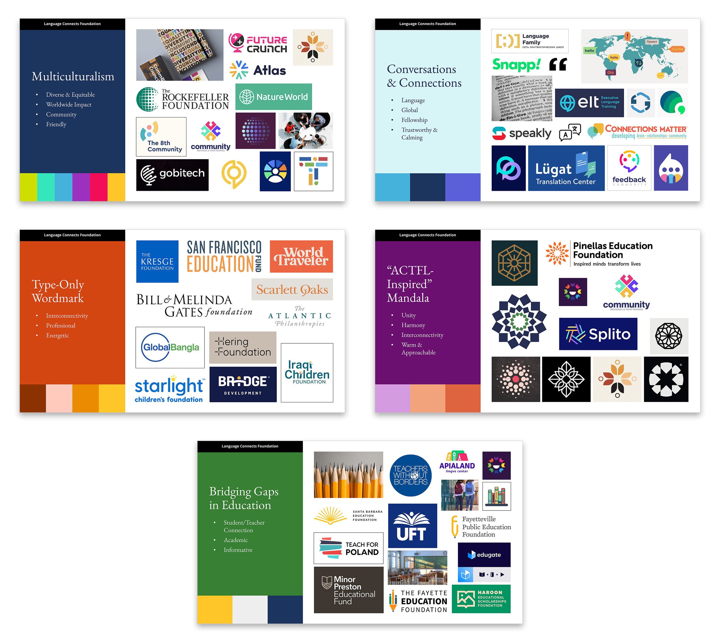
Exploring a Myriad of Possibilities
The ACTFL team enthusiastically chose the moodboard that honed in on this idea of “multiculturalism” but were also very interested in any plays off of their “mandala-styled” logo. I honed in on a few executions that seemed to touch on the ideas brought to light in our Discovery. We explored more abstract concepts using rising suns and books to form the initialism “LCF” and imply the idea of the limitless potential education gives you, more literal riffs off of globes and connections, and abstracted people forming a sense of community while also inheriting a strong brand association with ACTFL’s current logo due to the structural similarities.
A Multicultural Community
From the beginning, the ACTFL team loved the idea of using a group of abstracted people standing strong in a circle and creating a sense of community and connection through that representation. The people’s “arms” are formed from a series of “C’s” for “connection” with the overall shape of the icon implying the world.

Translating Multilingualism into a Visual Language
In the brand implementation stage, we ended up utilizing a painterly photographic treatment. The in-progress “part sketch, part watercolor” effect is meant to imply the idea that we need language to make us whole and to add color and dimension to our lives.


“Nicole Griffing’s logo work was brilliant. She’s incredibly talented, collaborative, took feedback like a champ and is a delight to work with. LOVE her.”