Every Body Texas
Everyone has a right to high-quality sexual and reproductive healthcare. And Every Body Texas is here to make sure every “body” in Texas does.
Role
Lead Designer
Client Services
Naming • Branding • Messaging • Photography • Marketing Collateral • Website Design • User Experience Strategy
Awards
GDUSA's 2021 American Graphic Design Awards™
ASAE Gold Circle award for Branding - 2022
Objective
The Women’s Health and Family Planning Association of Texas (WHFPT, phonetically known as woof-pat) had a big problem. As their team has grown in order to effectively distribute Title X funds across the entire state of Texas, their name no longer fully encompassed all they did and everyone for whom they advocated. They needed a complete transformation in order to tell their story.
Quite an undertaking—but one we were incredibly excited to take with them.
Strategy
We guided the WHFPT team through the rebrand starting with an entirely new name. We then took all that we had learned in our strategy sessions and collaborated to create messaging, a logo, brand guidelines and marketing collateral, and last but not least, a website built from the ground up. Thanks in large part to the passionate team at Every Body Texas, they continue to advocate to ensure that every person in Texas can access safe, unbiased and high-quality sexual and reproductive healthcare.
A New Brand
A key piece of the puzzle in this rebrand and something that was important to the client was representing the Every Body Texas team as a group of “bridge builders,” connecting and supporting providers, working to close the gap between them and their clients. The icon meshes the idea of bridges and this tightly knit community of people. The layering of figures alludes to support, giving the feeling of people behind you, backing you up. They are lined up in a row, presenting a united front and are diverse in size and color. The upward slope of the people references growth and progress, implying that with us, you can increase your access and improve your quality of care. All of these allusions combine within this logo to serve as a visual reflection of those ideals.
A Clear Audience Track
Throughout the Discovery process, we noticed that Every Body Texas had 3 primary audiences: clinic providers, the general public, and legislators. This informed not only our logo design, but also how we designed the website. We developed an audience navigation bar under which Every Body Texas is able to organize pages segmented specifically for those people. The result was an easy-to-use design system for their team to implement and their users to follow.
Find a Clinic
One of the most crucial tools in Every Body Texas’s arsenal was and is their website’s ability to search for nearby Title X Clinics. Users found their old “Find a Clinic” page difficult to use and lacking all the necessary information needed for it to be effective.
With the new website, we worked to make sure this tool worked hard for them and not the other way around.
A Great First Impression
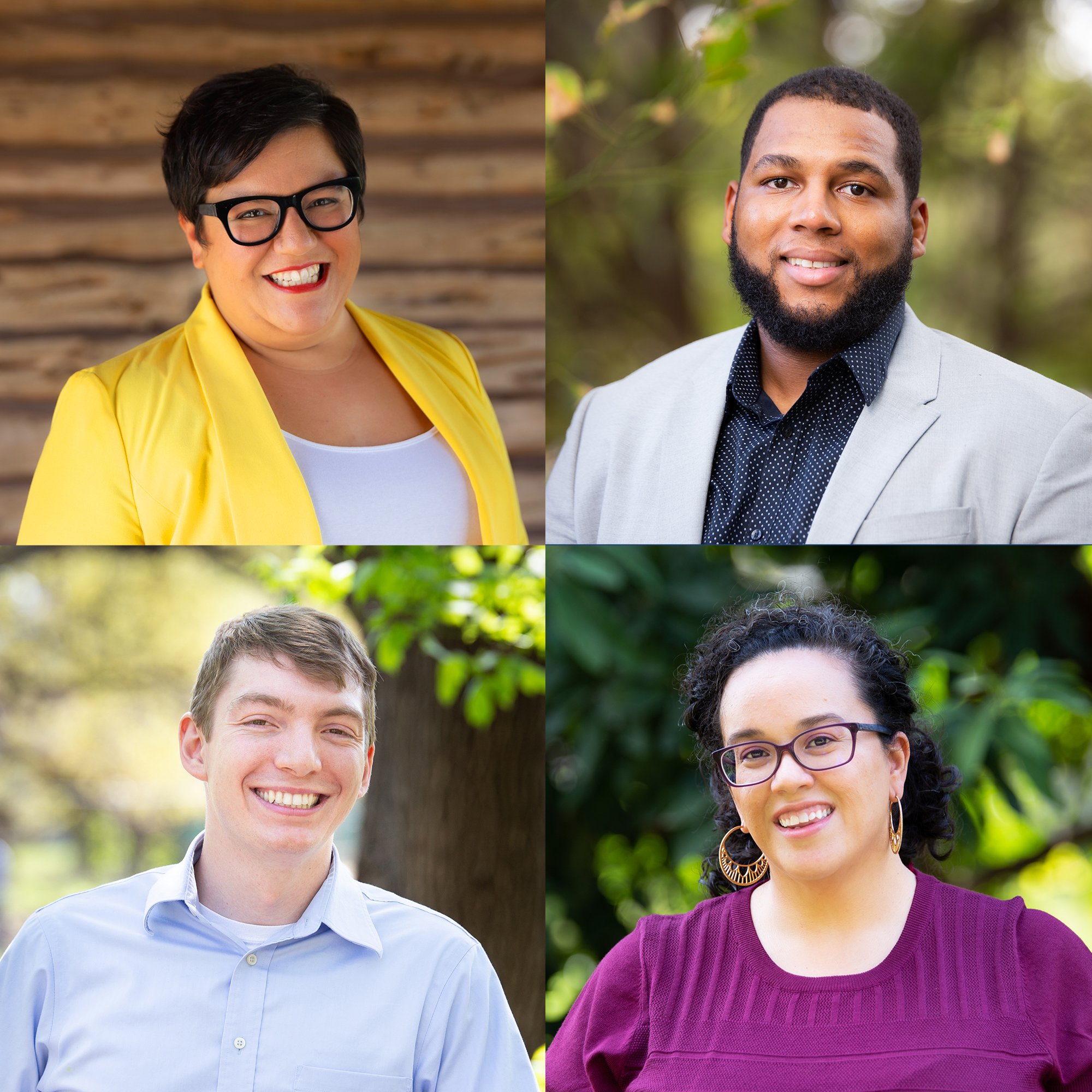
Hand-in-hand with a colorful, new brand, Every Body Texas also needed new headshots that showcased their team as the friendly, approachable, and passionate people that we knew them to be. We shot at a variety of outdoor locations so as to not only follow COVID-19 protocols and achieve the sort of casual ambience that Every Body Texas wanted, but also so that as the team continued to grow as they have been, they could more easily and naturally mix in new members on their team page.
“I had the pleasure to work with Nicole through Mighty Citizen and the work they did to rename and brand our organization and to build a new website. Nicole took our big, scattered vision of our organization and built a beautiful brand that reflects our values and energy.”


